Introducing A Simpler Blog Commenting System

I’ve been doing a lot of thinking on commenting recently. Most of our information is out on the web already, why is it that we still have to re-enter it every time we want to make a blog post comment? Good design is all in the details and the only reason for the email form is to keep in contact, I can do that on twitter. Besides, isn’t this a little overkill?
I am not a big fan of authentication badges, due to the very fact that people are not quite sure what they will be giving up or posting by clicking. I am even hesitant to click on the badges when there is no clear call-to-action what they actually will do.
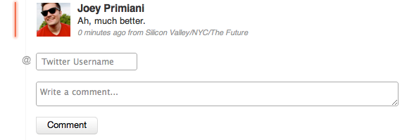
I decided to come up with a completely custom commenting system that is a super fast, simple and auth-free way to collect all the data needed. The solution – a wordpress twitter hybrid commenting system.
It’s easy. You enter in your twitter username and comment and this pulls the avatar (transient thanks to Joe Stump’s http://tweetimag.es/), full name, location and website url. The obvious caveat is that you have to have a twitter account, but I anticipate the target audience to have one already, even if not active.
Next step… comments across the web are more fragmented than ever. There needs to be a unified way to federate them together (ie Google Wave commenting example across platform).
Interested to know what you guys think, leave a message in the groovy comments below.
[UPDATE] – Download the official wordpress plugin here

 I’ve been getting a lot of inquires recently regarding my logo. What does it mean? What is it? etc… I purposely designed it to represent many elements of me and what I stand for. Starting from left, clockwise – the conch shell represents my love for the golden ratio, fibonacci sequence, numerology and the math that is all around us in nature. The star represents all things mystical, mysterious, magical, energy, power, the occult, the divine, the goal, unknown, paranormal, science, the cosmos and anything astronomy related. The smiley face represents happiness, joy, positivity, bliss and love of everything. The girl represents wisdom and infinite knowledge. The spiral reminds me of designing and art. Three blocks, because three is one of my favorite numbers. JP is my initials (and twitter username @jp) and red and black have always been my favorite colors. From bottom up, the swirl also purposely looks like a giant squid tail going up to the stars – representing everything in between from the deepest darkest oceans to the stars in the sky, the journey in life is what matters. Overall, I think the reason why it was received so well is that it is fun, creative and has that ultimate whimsical feel.


