Think brighter! Out with the dark and grays, turn a boring sad rainy day design happy and bright. I’ve been noticing a common trend around the web, and that is to include excess amounts of grays and dark heavy elements.
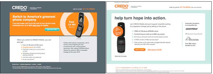
The key to effective landing page design is clarity. The visitor should be focused on taking a simple path that leads to the desired conversion action. Take these two before and after examples:


The results were stunning.
The client ran a split test to their email list. The winning new version had an 84% better offer conversion rate (84% more people signed up for the plan when they saw the new page). Why the radical difference?
What can be learned from this research study:
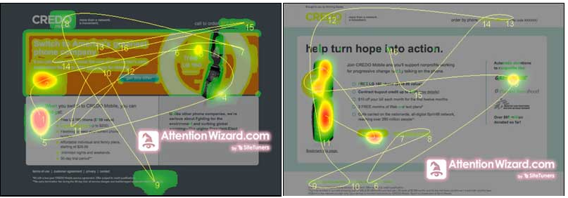
It can be argued that the landing pages are similar. Both show a single image of a phone and a distinct call-to-action button. In order to answer this question my agency employed our visual attention prediction tool.
By understanding the way the visual perception system and brain works, it is possible to accurately simulate with software how a site will be viewed during the first few seconds of eye movement, and where attention will be focused.
The results are instant and do not require expensive eye-tracking studies, or page-tagging and time-consuming data gathering to create mouse-tracking heatmaps. “Attention heatmaps” can even be created based on in-progress visual mock-ups that have not been deployed as live pages.
The “before” page shows scattered eye movements (yellow lines) that bounce all over the page. Drawn by bright blocks of color and sharp areas of contrast, the eyes do not find a place to “settle.” The colored attention heatmap likewise shows attention spread into many areas on the page. In the midst of all of the visual “noise” the most important green call-to-action button is lost and ignored.
A few things this does, this increases speed perception and visitor frequency. Research studies have shown that people often enjoy returning back to a site that is lighter than one that is dark. It is ingrained in us as humans it is natural to read dark text on light background. Makes sense right?
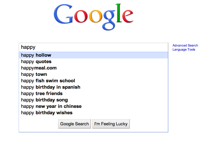
Given another example below – What is easier to scan? Which one is friendlier to look at?


So when you are designing your next site or app, give color some major thought. Color and texture is one of the most important ways to communicate to your message to the audience, and is often overlooked.
Thanks to Clickz and Attention Wizard for providing the heatmaps