It is no surprise that Gawker’s new design is driving people away. The reasons are simple: there is less content on the page and page load time is significantly slower. This is my attempt at redesigning the site to its optimal. Please note, I am designing with the ultimate goal of increased page views in mind. If there are other user happiness success metrics that Gawker has that I am not aware of, it is not addressed with this first stab design.
Noticeable changes:
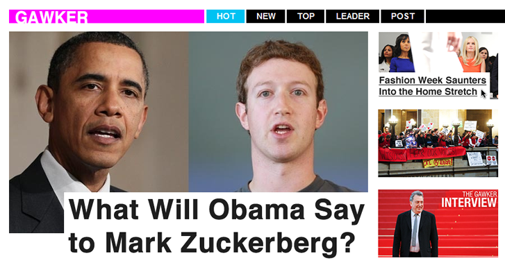
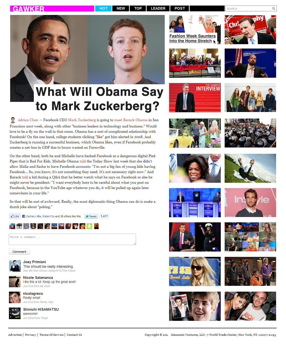
* Top navigation is clear and consistent between homepage and leaf pages
* The right side increases user stickiness and discovery to similar articles (like YouTube)
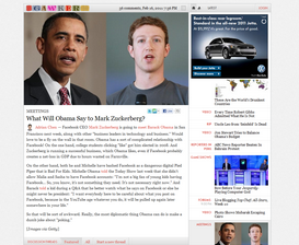
* More of the article above the fold
* Overall visual design is less heavy and bulky
* Simpler and added colors to add some fun – more appropriate for a gossip site
* Larger header fonts – using Helvetica
* Modern and simple logo & brand
* Simplified commenting system, using jpComments to increase community engagement
* Occam’s razor is your best friend
Love to hear your thoughts in the comments below.
Chelsea
Ah, this is so much better!! You should send this to them.
Feb 17th, 2011 from Portland, OR
Brent D Smith
Really like what you got going on with the right nav stickiness idea. I would find myself spending much more time on the site “going down the rabbit hole” like Wikipedia this way.
Feb 17th, 2011 from bangkok thailand
Joey Primiani
@Chelsea Yes, planning on it. @Brent Exactly, that is what I had in mind. It works really well for YouTube.
Feb 17th, 2011 from Silicon Valley/NYC/The Future
Feeh GaGoo
Much simpler design – I like!!
Feb 17th, 2011 from Curitiba
Caio
Beautiful.
Feb 17th, 2011
Sean Fissel
combine your pretty images with their labels that communicate the different categories that articles might fall under and you have yourself a winner. I love what you have going on but I dont want to mouse over everything to be able to read at least the category.
Feb 18th, 2011 from frisco
M Haidar Hanif
So far so cool. But you also need to make sure it works so well.
Then, just wondering about the color identity. 🙂
Feb 18th, 2011 from Calgary, AB, Canada
Melodi Cowan
superfuture.
Feb 18th, 2011 from San Francisco, California
PJ Accetturo
you win at life, joey. I hope they take the design
Feb 18th, 2011 from Tampa, Florida
Dustin Snider
Make it a Chrome extension.
Feb 19th, 2011 from Central New York
Nikki Lee Ezelle
Simplicity, Colors, JPcomments #ftw JP revamp > gawker. i love it.
Feb 20th, 2011 from Your Future
Justin Sepulveda
Where are the ads? 😉
Feb 27th, 2011 from Carlsbad, CA
Simpleet
Ability to hide the stickiness bar may have been nice. After all, left focus and visual thumbnails in the side, can pose a distraction. But of course, will need to conduct a usability on that. 🙂
Feb 27th, 2011 from Malaysia
Phill Kenoyer
I just don’t see what’s wrong with the current Gawker sites. I kinda like the design and layout.
Feb 27th, 2011 from Nevada
hornetweb
It’s good, but personally I dislike too much content on the right. On many sites this space is used for ads and non important content, and my eyes get drawn away, back to the middle or left of the page, where the main block of text is too large.
Feb 28th, 2011 from North Yorkshire
Chris Dizon
I like the new design, but I don’t like the mystery meat navigation on the thumbnails. Don’t just display the headlines on hover.
Feb 28th, 2011 from Phoenix, Arizona